Influence diagrams are a good way to get a high-level view of the key factors in an expected value decision. The diagram is used to construct a decision tree, from which a set of expected values can be calculated.
What is an Influence Diagram?
An influence diagram “shows the factors considered to be relevant to a decision and indicates the linkages among them.”[1] The factors are represented by shapes. Arrows show the direction of influence among these factors. Here’s a simple influence diagram:
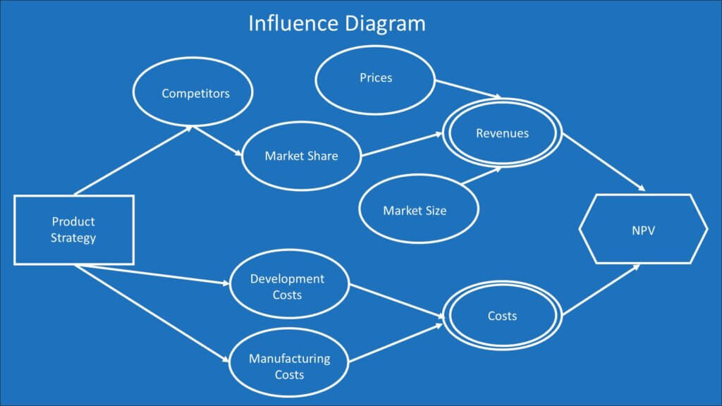
This diagram shows the decision model for choosing a product strategy. The decision is whether to build a high-value product with a high price or a low-value product at a lower price. The decision is shown at the left of the diagram, the factors are shown as ovals in the middle of the diagram, and the objective is the Net Present Value (NPV) shape at the right. The objective is the value used to assess the outcome of the decision. I’ll go into more detail about the diagram design a little later in this lesson.
I’m using this simple diagram for illustrative purposes. You could make this diagram much more complex. You may be able to identify many other factors. You may set decision criteria other than NPV. Like all models, we must balance detail and complexity with the benefits that come from simplicity. A simple model makes it easier to communicate with decision-makers. It can also focus attention on key factors.
Names and Relationships
Influence diagrams are known by other names. These include:
- Value maps
- Decision diagrams
- Relevance diagrams
- Decision networks
Sometimes, the name used tries to clarify the relationship between the factors. One of the developers of these diagrams prefers the term “relevance” to “influence” because “knowledge of one uncertain event is relevant to the knowledge of a second uncertain event and not that one event ‘influences’ the outcome of the other event.”[2]
This may seem like semantic hair-splitting, but the relationship between factors in a decision is crucially important. The term “influence” diagram reflects the probabilistic rather than certain relationship between factors. The term “relevant” indicates a relationship that is not even causal. Thus, the correlation and causal relationships must be determined in the decision-making process. In our example, they would be crucial for determining the probabilities and dollar amounts of NPV outcomes used for calculating the expected value.
Why did I choose the term “influence diagram” for this course? I googled the different terms above, and the term “influence diagram” was used much more often than the others. The crowd has spoken, and I have followed them.
Benefits
An influence diagram provides many benefits to the decision-making process. The diagram provides a high-level summary of the decision. It helps:
- Clarify complex decisions
- Identify the uncertainties in the decision that may benefit from sensitivity analysis
- Show the key factors and the relationship between those factors
- Determine how the factors relate to the value used as the decision criteria
- Identify where expert assessment may be needed for key variables
- Clarify the order in which uncertainty might best be reduced to arrive at better decisions
- Communicate how the decision is structured
Building an Influence Diagram
The process of building an influence diagram often starts with a person or group defining three things:
- The decision
- The factors in the decision. These are the uncertainties in the diagram.
- The value or criteria used to assess the outcome. These are called the “value” or objective in the diagram.
These items are placed into shapes that represent their function in the decision-making process. They are the nodes in the diagram. There are some common conventions for these shapes. They are:
- Decision: Rectangle
- Uncertainty: Oval. A calculated uncertainty is sometimes represented with a double oval. I’ve used this convention in my example for revenues and costs. The uncertain assumptions for those calculations are represented as simple ovals in this format.
- Objective: Octagon
These shapes are usually presented visually from the decision to the objective. Some people put the decision on the left of an image with arrows that lead to an objective at the right. This is the format I used in my example. Others put the decision at the bottom of the image with arrows that lead upward to an objective at the top of the image.
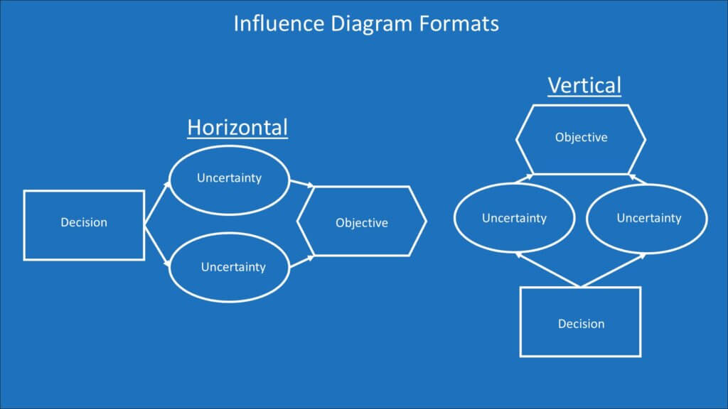
The horizontal format follows the flow from the decision to the objective. The vertical format highlights the objective and shows how the decision and factors lead to it.
The arrows all lead to the objective, but the process of identifying the nodes often starts with the objective and then leads to the decision. My example diagram starts with thinking about what influences a higher NPV. The NPV formula is a series of revenue and expense cash flows, but those are influenced by the other nodes. The decision is the strategy options we have to maximize the objective we want, subject to the uncertainties.
A rule that’s important for the design of influence diagrams is that the arrows never form a loop. They all flow from the decision to the objective. If any flowed backward, it would be like the dreaded circular reference in Excel. Our expected value calculation would get stuck in the loop, never leading to discrete probabilities and outcome values.
The influence diagram helps clarify some key tenets of decision theory and behavioral finance. The very term “influence” challenges the behavioral bias of an illusion of control. Decision theory says decisions must be judged by the decision process and not the outcome. The only item that company leaders control is the decision choice among alternative strategies. That decision flows through a network of uncertainties.
The objective node states what we value. There are many potential outcomes to be measured against that criterion. The probabilities of each of those outcomes and the amount of value from those outcomes can be mapped with a decision tree, which is what we’ll look at next.
For more info, check out these topics pages:
[1] P. 97 of Decision Quality by Spetzler, Winter, and Meyer
[2] p.375 of Handbook of Decision Analysis by Parnell, Besnick, Tani, and Johsnon