You can use regression and trendlines in Excel to calculate the change in sales for a change in price. In this article, I’ll show you a few ways to do this analysis.
Regression is a way to measure the relationship between sets of numbers. If there appears to be a strong correlation between the variables, then one variable may be used to forecast another. Embedded in the summary output are the numbers for that forecast formula.
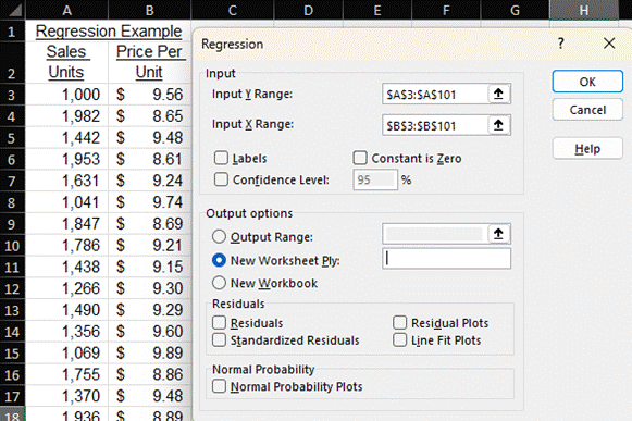
I created a sample dataset of sales units and prices. We intuitively know that sales volumes will decrease if we increase the price per unit. Regression can help inform how much sales volumes will decrease for a dollar increase in price. Below is a screenshot that shows some of my data and the Regression dialog box, which is part of the Excel Analysis Toolpak.
Once I click OK, a new worksheet with many statistical calculations is created.
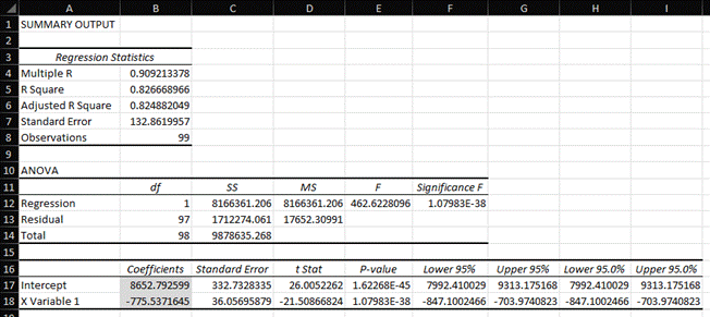
Some of these statistics, like R Square, tell us how well the dependent variable (i.e., sales) is explained by the independent variable (i.e., price). I created a dataset for this example with a high R Square.
I shaded two numbers in Cells B17 and B18 that will help us build the formula for the regression line of the relationship between price and sales. You may remember from math classes long ago that the formula for a line is y = mx + b. Let’s restate that with the variables from our analysis:
Sales Units = Slope of the Regression Line X Price + Y-Intercept of the Regression Line
The slope of the line is in Cell B18. It says that sales units decrease by 775 for every $1 increase in price. This is a measure of the sensitivity of customer demand to price. Will the contribution margin increase from the price increase be more than the contribution margin lost from fewer sales? This is a very important number to know when calculating the marginal profit of a price change, which is a form of CVP analysis. You can check out my pricing or marginal profitability courses for more information. The Y-intercept is in Cell B17. It’s 8,653.
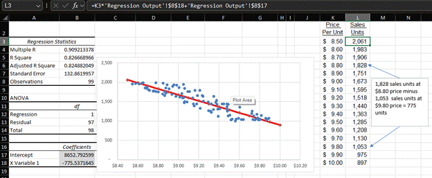
Below is a graph of that regression line and an XY scatter plot of my sample data. The table on the right is how I constructed the regression line, and the formula bar shows the formula for Cell L3 to calculate sales given a price. The text box on the far right shows how sales drop 775 units when I increase the price by $1 per unit.
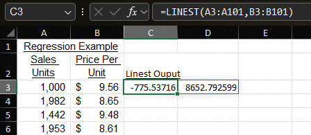
Maybe you’re the type of person who doesn’t want all these regression stats. You just want to know the slope and intercept. I have good news for you. You can just use the LINEST function. The formula is =LINEST(Known Y Values, Known X Values). The formula for my example is in the formula bar below. The slope is in Cell C3, and the intercept is in D3. These match the regression analysis.
Then again, you may be the type of person who wants Excel to draw a trendline for you that tells you all the information we’ve just looked at. We return to the XY scatter plot without the regression line. Then click Add Chart Element and the Trendlines. We have many types we can choose from.
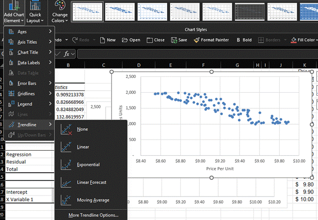
We’ll pick “Linear” and then select “More Trendline Options.” This opens a format trendline box. I’ll click the boxes for “Display Equation on Chart” and “Display R-Squared value on chart.” Our chart now looks like this:
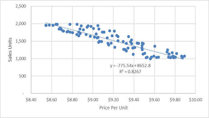
The trendline is a dotted line through our data. The equation shows the slope, which represents our price and volume trade-off. We even have the R-Squared value to prove that pesky person wrong who will say our analysis isn’t statistically meaningful.
For more info, check out these topic pages: