Tornado diagrams are also called tornado charts or tornado graphs. You’ll understand why the word “tornado” is in the name when you see an example.
A tornado diagram is a way to communicate the outcomes of sensitivity testing. It graphically displays the range of outcomes for each input variable, assuming all other variables remain constant. The range of outcomes for each variable is a bar on a bar chart. The bars are sorted from the largest change in profit to the smallest. In essence, a tornado diagram is a bar chart of a series of one-way sensitivity analyses.
The steps to creating a tornado diagram are:
- Identify the variables to test and their base value, which is often the median value.
- Identify the low and high bounds of the sensitivity testing. The low and high amounts of the range come from the P10 and P90 values or the 90% confidence intervals. These are the bookend amounts.
- Calculate the outcome value for low, base, and high amounts of the range for each variable one at a time. When calculating the outcome value for each variable, all other variables are set at their base case value. The output value being calculated is usually a profit metric like net present value (NPV).
Tornado Diagram Example
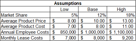
Here’s an example of building a tornado diagram. This example is for a new store location. The first table lists the low, base, and high assumptions:
The next step is to calculate the net present value (NPV) using the low and high amounts for each assumption. Here are the results:
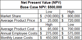
Note that high NPVs result from low values for costs and vice versa. This table has all low NPVs for the assumptions in the first column of numbers and all the high NPVs in the second column of numbers. The reason for this format will be clearer in the next table and the diagram.
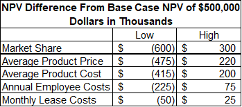
This table calculates the difference between the low NPV and high NPV from the base case NPV for each assumption. For example, the low NPV for market share is -$100,000. The base case NPV is $500,000. The difference between the low NPV and base case NPV is -$600,000 (i.e., -$100,000 – $500,000), which is the number in the upper-left corner of the table. For the diagram that we’ll soon see, it’s best for the assumptions to be sorted from the assumptions with the widest range of NPVs to the assumptions with the narrowest range of NPVs.
It’s now time to present this table as a tornado diagram.
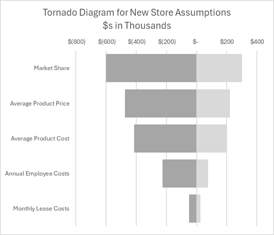
With the largest bar on top followed by increasingly smaller bars, it looks like a tornado (at least to analysts whose eyes are weak from staring at numbers all day). In the days when analysis was handed out in black and white paper from a copy machine, the grey bars – and only grey bars – enhanced the appearance of a tornado. I made my bars shades of gray rather than color in a nod to that historical presentation.
Tornado diagrams must have been named by someone in the Midwest. I’m from the Northwest. We would have stacked the bars with the biggest on the bottom and the shortest on top, which we would call a mountain graph or a volcano graph. Like Mount St. Helens, you could then just blow off the top of the mountain and explore the base. The wide bars at the top of the tornado (or the bottom of my volcano) are the most sensitive assumptions for profit. These are the assumptions you want to spend more time analyzing, as I’ll explain later.

If you want to learn the detailed steps for how to build a tornado diagram in Excel, check out this page.
Benefits of a Tornado Diagram
An important benefit of sensitivity analysis is identifying the key assumptions for analysis. Key assumptions should receive more time to improve their accuracy. The analysis cost is more than compensated for by higher profits from better decisions. Unimportant assumptions can be excluded from the decision model or profit calculation. This simplifies the model. Simple models are easier to communicate and less prone to errors.
Identifying key assumptions has a much more important function than model mechanics. Leaders know where to spend time and effort to improve the uncertainties and assumptions. A diagram can show whether there is more profit potential from efficiency cost savings or pricing power from product development and marketing. Leaders may decide to hedge the downside risk of key variables like interest rates or currency rates.
Ultimately, tornado diagrams help business leaders better understand their business model. Leaders are constantly bombarded with information. Knowing the key assumptions helps them filter and prioritize that information. This increases efficiency and effectiveness. If nothing else, it helps improve the managers’ sanity.
Another benefit of tornado diagrams arises from whether the bars primarily stretch left (bad) or right (good) from the base cases. This represents the risk of each variable. The base case amount may look good, but proceed with caution when many uncertainties can lead to highly negative outcomes.
Tornado Diagram Weaknesses
Tornado diagrams are a graphical representation of one-way sensitivity analysis. They are thus subject to weaknesses of one-way sensitivity analysis.
One weakness is that it doesn’t show any potential correlations and dependencies between variables. It’s possible that a group of assumptions with low variability in a tornado diagram are highly correlated so that their combined impact is large. Identifying these correlations is the job of financial analysts and decision-makers. It’s why they (i.e., just the decision-makers) get paid the big bucks.
For more info, check out these topics pages: