In this post, we’ll be cruising through S-Curves and soaring through a high-level view of flying bars. Either way, it’s a moving experience.
A Drive Through the S-Curves
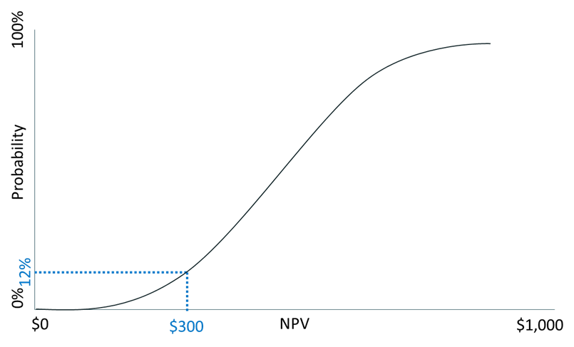
An S-curve is a cumulative probability curve. The x-axis is a range of possible numbers. The y-axis is the cumulative probability, not the probability density of each number or sub-range of numbers in a standard curve. The graphed line starts at zero on the left and then rises to 1 (i.e., 100% probability).
One problem with S-curves is that they are hard for people to understand. If your report users are struggling with the concepts of a standard distribution curve, it’s going to take some training and practice before they’re proficient with cumulative probability curves.
The graph below shows the cumulative NPVs of a hypothetical potential new product. It shows that we have a 12% chance of having an NPV of $300 or less for the product. I use small numbers for the examples in my courses. You can add however many zeroes you want to $300 to match the size of your company.
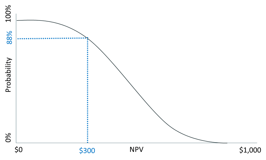
The inverse of the cumulative S-curve is the percentile confidence curve. In the cumulative probability curve, we had a 12% chance that the product would earn a $300 NPV or less. This means we have an 88% probability (i.e., 1-.12) of having an NPV higher than $300. The percentile confidence curve starts at 100% confidence and then goes to zero. The choice between a cumulative probability curve and a confidence curve is determined by how you want to frame the question and what decision-makers are used to seeing.
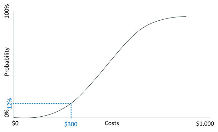
A cumulative probability curve can also show the probability that you can make a product at or below a target dollar amount. Imagine you did a break-even analysis that showed you needed a variable cost per unit of $300 or less to break even. An S-curve can tell you the probability that you can achieve this. In this graph, there is a 12% probability you can do this for $300 or less. This is a good example of deterministic modeling (i.e., break-even analysis) combined with probabilistic modeling.
Cumulative curves are an excellent way to select between investments when you must make a mutually exclusive choice between them.
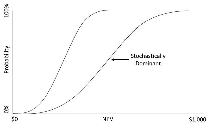
When the line of one choice’s NPV is to the right of another line at all points, the line to the right is said to be “stochastically dominant.” In plain English, it means it’s a no-brainer to pick the investment on the right instead of the one on the left. The NPV is expected to be higher at all points for the line on the right. The situation gets a little murkier when the lines cross. That means that there are times when each of the two investments has a better chance of a higher NPV.
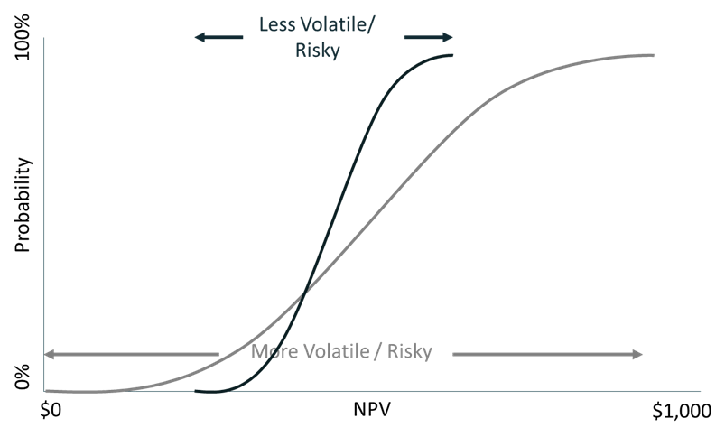
The steeper the slope of the line of the S-Curve, the less the volatility of potential outcomes.
Flying Bars
Anyone who has been on a flight loaded with people going to Vegas, a vacation, or a sports event knows that these crowds order a lot of alcohol during the flight. The flight attendants likely feel like bartenders of a flying bar.
Flying bars in financial analysis refer to something totally different. In fact, financial analysis flying bars can be quite sobering to management.
Flying bars are a way to show a portion of the range of possible outcomes, such as NPV. It may be more intuitive to people than distribution curves.
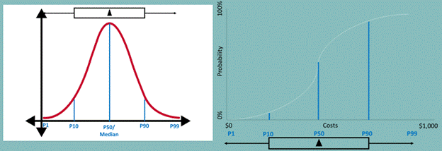
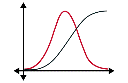
Instead of showing the full shape of a curve, flying bars only show six key points. The image above shows how the shape of a flying bar maps to the shape of the distribution curves that we looked at earlier. Here’s more information about the six key points of the flying bars:
- P1: An extremely low number. You would only expect 1% of a population to be lower than this. This is the tip of the point of the left arrow.
- P10: A very low number. You would expect 10% of a population to be lower than this. This is the left edge of the bar.
- P50: This is the median. Half of all values are above and below this. This is shown as a vertical line within the bar. I didn’t show this in my example because it lies directly behind the triangle in my normal distribution graphs. This is sometimes omitted from flying bar graphs.
- EV: This is the expected value, which is often measured as the probability-weighted net present value in business analysis. This is a triangle placed within the bar.
- P90: A very high number. You would expect 90% of a population to be lower than this. This is the right edge of the bar.
- P99: An extremely high number. You would expect 99% of a population to be lower than this. This is the tip of the point of the right arrow.
Below is an example flying bar chart to compare the NPV (in millions) of two product options. Product B has a higher expected value and median NPV. Still, there is a chance that Product A could produce a higher NPV than Product B. This would occur if the actual NPV of Product A was near the right of its bar and the NPV of Product B was near the left of its bar. Most companies would pick Product B out of these two options.
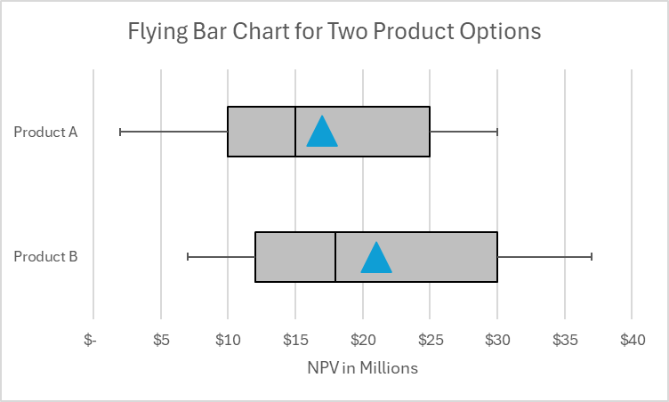
Flying bars are sometimes shown with their wings clipped. In other words, the graphs don’t have arrows on the sides of the bars. We’re getting into mixed metaphors because the wings we’re clipping are the tails of the distribution curve. This focuses on a narrower range of likely outcomes rather than the potential very large range from P1 to P99. There is not a high likelihood that wings (i.e., tails) may occur, but they may have a significant impact on a company.
A drawback of flying bars is that they can’t be easily created in Excel. It can be done by modifying a box and whisker diagram in Excel. If you want to know how to do it manually and how to get an Excel plug-in to do it, check out https://peltiertech.com/excel-box-and-whisker-diagrams-box-plots/.
For more info, check out these topics pages: