Graphing variances and performing statistical calculations on variances are two ways to get a bigger picture of forecast accuracy.
Graphing Forecast and Actual Amounts to Detect Bias
Some people are optimists; some people are pessimists. Some people see the glass half full; some see the glass half empty. Some people are constantly predicting huge numbers that are never achieved; some predict low numbers that are consistently exceeded.
We’re all human and subject to biases. Throw in performance evaluations and bonus plans, and we’re all trying to manage expectations to exceed them. When we want resources, we make big promises to justify the costs. Forecast accuracy suffers from all of this.
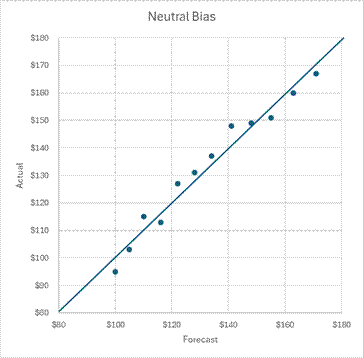
One way to detect patterns of bias is by graphing multiple forecasts against the actual results. The X-axis of the scatterplot graph below is the forecasted amount. The Y-axis is the actual amount. If we were clairvoyant, our forecast amounts would equal the actual amounts and would fall on the upward-sloping line. I won’t speak for you and your company, but my coworkers and I have not been so accurate or lucky. The best we can hope for is a graph where dots lie slightly above and below the line, like the one below.
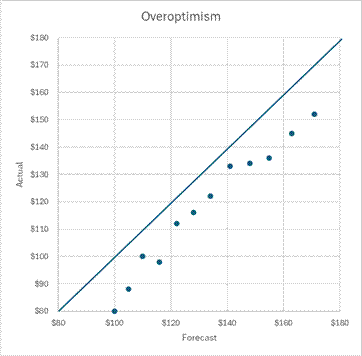
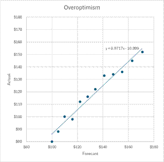
I’ll discuss common sources of forecast error in a later lesson. One of them is overoptimism. In overoptimistic forecasts, the forecasted amounts are always more than the actual amounts. The graph below shows dots consistently falling to the right of the line where forecast equals actual amounts.
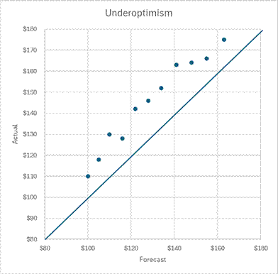
“Sandbagging” is a term for forecasting amounts that are consistently exceeded. Below is a dot plot for a chronic sandbagger.
These graphs are diagnostic tools. They identify a problem but don’t tell you how to fix it. Admitting you have a problem is the first – and very big step – to recovery.
As I worked with people, I began to learn who gave me high numbers and who gave me low numbers. With budgets, I had to put in the budget whatever was approved by their supervisor. I could push back against those numbers. The above graphs are a way to show bias. At the end of the day, it was their numbers or a compromise set by a senior leader or committee.
Forecasts were often my numbers. I could adjust the source information to amounts that I believed to be more accurate based on past variances. In essence, I was shifting the dots to the line to remove potential bias. The amount that dots need to be shifted can be determined by some variance statistics that we’ll now look at.
Variance Statistical Calculations
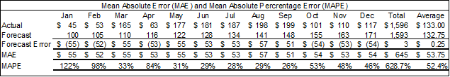
Some simple calculations can show us how much our forecasts have been off in total and as a monthly average. Below is the dataset I used for the above neutral bias graph.
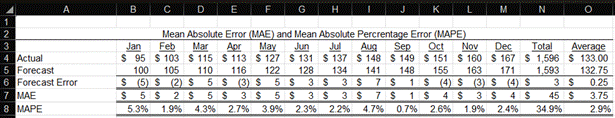
The monthly forecast error is simply the actual amount minus the forecast amount (i.e., Row 4 minus Row 5). The total forecast error in Cell N6 is only $3. Note that I have rounded almost all dollar amounts to the nearest dollar. The average error in Cell O6 is only $.25. As always, I have also used small dollar amounts for ease of presentation and explanation. Feel free to add as many zeros to the end of the numbers to make them feel “real” for your company. The $3 cumulative error is only .18% of the total forecast amount of $1,593. I would be ecstatic to have such a low forecast error over a year. I’ll show later how I could have the same low total forecast error but horrible monthly variances throughout the year.
Row 7 calculates the Mean Absolute Error (MAE). Each month, I calculated the absolute value of the forecast error. The formula for Cell B7 is =ABS(B6). The sum of all these monthly absolute amounts is $45, which is in Cell N7. To get the mean monthly amount, you divide the $45 by 12 (i.e., 12 months) to arrive at a mean absolute error of $3.75. For you math formula fans, my description of the calculation can be summarized as MAE = (1/n) * Σ|Actual – Forecast|.
The total cumulative error was only $3, but a mean absolute error of $3.75 means each monthly variance is likely to be larger than my $3 total variance. Summing the absolute values of the variances exposes offsetting variances that the total cumulative error obscures.
To get a context of our absolute errors in relation to the actual amounts, we can calculate the Mean Absolute Percentage Error (MAPE), which is in Row 8. For each month, the absolute value of the forecast error is divided by the actual amount. The sum of those percentages (Cell N8) is divided by 12 to arrive at a MAPE of 2.9% in Cell O8.
I will now show why we often can’t just use a simple sum or average of the forecast error. The table below is the same as above, but the monthly errors are $50 higher for positive errors and $50 more negative for negative errors than the original table.
The total and average forecast errors are still $3 and $.25 in the updated table. However, the MAE is now $53.75, and the MAPE is 52.4%. The absolute value function of the MAE and MAPE formulas is absolutely valuable for capturing the volatility of the forecast errors (yes, that was a terrible math joke).
I had a boss once who said that there will always be errors in budgets and forecasts; you just hope for offsetting errors. Offsetting monthly errors can hide in the sum of forecast errors. Offsetting volume and rate errors can result in a total error of zero. MAE and MAPE expose offsetting errors that occur over time. Breaking out the volume and rate variance components can expose offsetting errors.
I’m showing MAPE because it’s a common forecast statistic. Many people don’t like it because it can throw out some very large amounts when there are low dollar amounts. It will result in an error if any month’s actual amount is zero. It puts a heavier penalty on negative errors than positive errors.
A similar statistic is WAPE, which stands for the Weighted Average Percentage Error. The WAPE is easy to calculate. It’s the sum of the absolute value of the monthly actual amounts minus the forecast amounts divided by the absolute value of the sum of the actual amounts. For formula fans, it’s Σ|Actual – Forecast| / Σ|Actual|.
The WAPE of our example starts with the sum of absolute values of the forecast errors in Cell N7, which is $45. That’s divided by the sum of the absolute values of the actual amounts. Since all my actual values are positive numbers, we can just use the sum of actual values in Cell N4, which is $1,596. The WAPE is then $45 / $1,596 = 2.8%.
Below is an example that shows the differences between MAPE and WAPE. This example is a seasonal company whose sales are high in the summer and low in the winter.
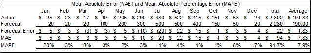
Their MAPE is 7.9% but their WAPE is only 4.1% (i.e., $94 sum of absolute errors divided by $2,302 total absolute actual). In MAPE, all variances are weighted equally. In WAPE, the percentage error is weighted by the actual amounts.
If the thought of using statistics to measure forecast accuracy makes you giddy, I’m happy to say that there are more formulas to use than you can shake a square root at. Here is a summary of some options:
- Weighted Mean Absolute Percentage Error (wMAPE) allows you to weight each month, which is useful if some periods are more important than others. Another option is to use the actual amounts as the weighting.
- Symmetric Mean Absolute Percentage Error (sMAPE) is a variant of MAPE that addresses MAPE’s issues with zero values.
- Mean Squared Error (MSE) is the average of squared differences. It penalizes large errors more than MAE. However, it’s a squared number in different units, making it hard to explain.
- Root Mean Squared Error (RMSE) is the square root of the MSE. This provides a squared metric in the original units. It’s more sensitive to large errors than MAE and can be overly influenced by outliers.
- Mean Absolute Scaled Error (MASE) compares forecast error to a naive baseline, making it scale-independent. To be honest, I have no idea what that means, but I included it in this course if it sounds interesting to you. This formula handles values near or equal to zero better than MAPE. Unlike the above measures, it penalizes positive and negative forecast errors equally, and penalizes errors in large forecasts and small forecasts equally.
- Mean Bias Deviation (MBE) shows whether forecasts are over or under the actual amounts. It’s a quick formula to show bias, but the graphs I showed earlier may be more intuitive, informative, and compelling.
Any metric must be understood for it to be informative. The cumulative forecast error, MAE, and WAPE I began with are fairly easy to understand with a little explanation.
The other formulas may be more accurate and informative in certain situations, but will require more explanation for general audiences. They may be better for analysts to monitor. If one of those formulas identifies an issue, the underlying cause and its implications can be presented without reference to the formula.
Fixing Forecasts
We can now calculate the amount to adjust forecasts. Once we have a set of forecast and actual forecast numbers from someone, we can use the calculations above to estimate their forecast errors and biases. We might then be able to adjust future forecasts from them using those calculations.
Below is a graph of an overoptimist. I’ve calculated the WAPE for their forecasts. However, I’ve weighted the WAPE by the forecast amounts, not the actuals. In other words, the WAPE is the sum of the monthly absolute variances divided by the total of the forecast amounts. I’m given forecast amounts, not actual amounts, so I want to calculate a number to adjust the forecast amounts. The WAPE is 11%.
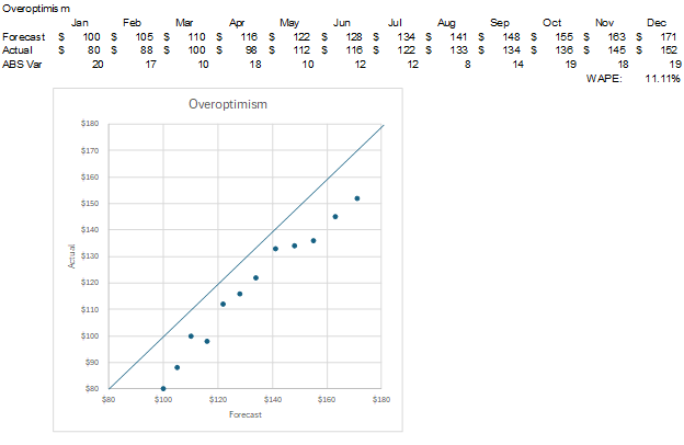
I can then adjust the forecasted amounts by the WAPE. Each forecast amount was multiplied by (1-WAPE). For example, the calculation for January is $100*(1-.11)=$89. The forecasts are now much closer to the actual amounts. Remember, forecasts equal the actual amounts along the upward-sloping line.
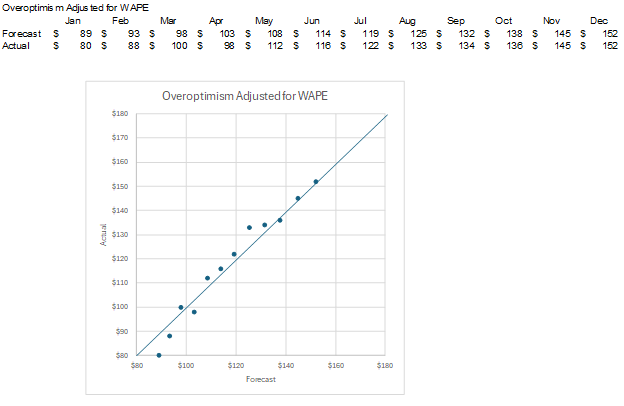
That worked fairly well because the slope of the forecast values to actual values was close to one, which is the slope of the line where the forecast amounts equal the actual amounts. I ran a trendline through the forecast in the image below and showed the equation for the line. The slope is .97, which is very close to one.
What if the forecast-to-actual line has a slope different than one? How can I adjust the forecast? Below is a new set of forecast amounts compared to the actual amounts. I’ve once again run a trendline through the forecasts and shown the formula for the trendline.
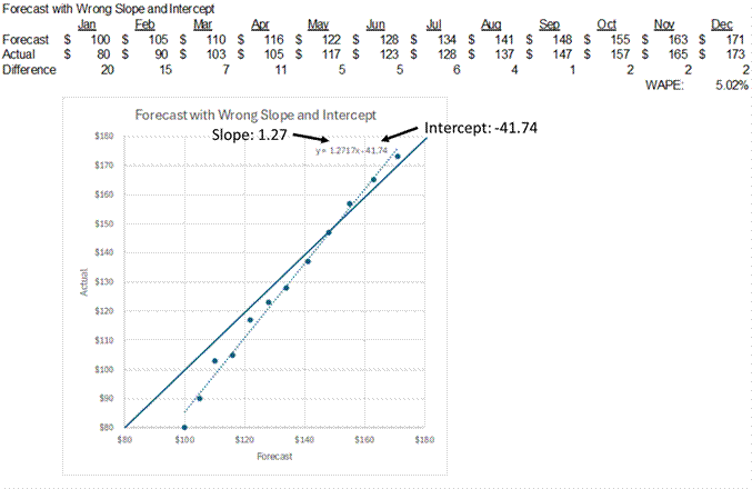
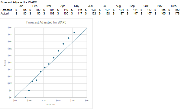
The slope is 1.27. The intercept is -41.74. These two numbers will be important later. Can I just adjust this forecast by the WAPE weighted on forecast amounts? I’ve calculated the WAPE to be 5%. Below are the forecast amounts adjusted by the WAPE.
The dots are now closer to the upward-sloping line, but their slope is still wrong. In the graph below, I’ve adjusted each forecast amount by the line trendline formula. The updated forecast amount is: Original Forecast * Slope – Intercept. January’s updated forecast is calculated as: $100*1.27-41.74 = $85. Below is the full set of updated forecast amounts.
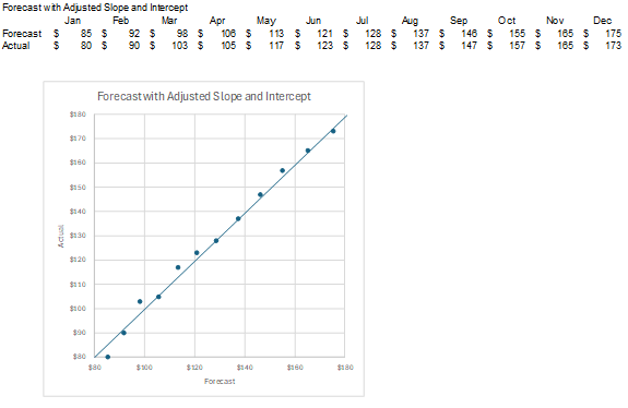
Both the slope of the forecasts and their distance to the upward-sloping line have been improved.
These are two ways to adjust bias in forecasts you receive or that you detect in your own forecasts. If you have seasonal actual amounts, you could use the monthly variance amounts in the past to adjust the same months in future projections.
The general rule is to identify the shape of the initial forecast, the shape you want it to be to match likely actual amounts, and adjust the forecast to the desired shape. You might use a simple mean percentage adjustment like I did with WAPE to shift by one dimension. You may need to use a line equation to shift across two dimensions.
There have been times when I’ve taken another approach to forecast data from others that I found to be unreliable. I worked at a bank where the lending groups would provide future loan growth that often differed from actual growth. I began to show loan projection graphs with both their balances and a simple trendline based on past actual growth. My job was to manage our bank’s liquidity so we were ready to fund either growth line.
For more info, check out these topics pages: