Excel’s Forecast Sheet functionality can seem like a magical Forecast-O-Matic. Let’s look at what it can create for you.
What is a Forecast Sheet?
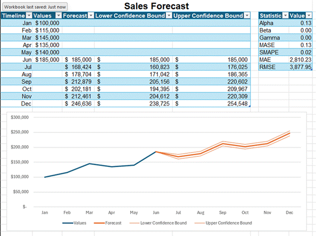
Forecast Sheet uses a set of past data to make a forecast from that data. It not only shows the forecast line. It also shows the upper and lower bands of a confidence interval, which I’ll discuss. Below is a sample forecast from a very small set of data:
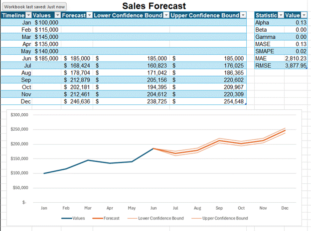
I entered six months of past data, which are listed in the Values column. I used a small amount of data for ease of presentation. You would normally want to use a larger dataset. I then waved my Forecast Sheet wand to create the rest of the data in this image. It creates forecast values, statistics about those values, and a graph.
I love that Excel doesn’t just forecast a single trend line. It also shows the upper and lower bounds of a confidence interval. A single trendline implicitly communicates too much precision for a forecast. If you’ve taken my other courses, you know that one of my favorite sayings from Decisive by Chip and Dan Heath is, “The future isn’t a point; it’s a range.”
The default confidence interval is 95%. That means 95 out of 100 actual values are expected to fall between the upper and lower bounds of the confidence interval. You can set that lower if you have higher confidence in the forecast’s accuracy and precision for picking the trendline. I will warn you that behavioral finance studies have shown that even CFOs are overconfident in predictions and set confidence intervals too tightly.
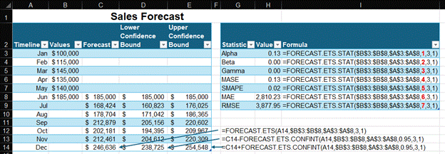
I’ll pull back the curtain a little to show some parts of this magical forecasting contraption. Forecast Sheet is based on a set of FORECAST.ETS functions. You could build this forecast with those functions without using Forecast Sheet. Below is a set of sample formulas in the analysis. I noted that the Statistics table is just the FORECAST.ETS.STAT function with varying second arguments to the function, which I’ve put in a red and bolded font.
It’s your choice. You can build this with formulas and create the graph. If you’re lazy like me, you’ll just use Forecast Sheet. It’s a very simple workflow. I’m also prone to making mistakes when entering formulas. Forecast Sheet also reduces those errors.
How to Build a Forecast Sheet
You need a data table with two variables in it to create a forecast sheet
- A list of dates: These dates need to be a consistent interval apart. Using a series of the first or last day of each month isn’t exactly a consistent interval since the number of days in each month varies, but it’s still fine for this function.
- A list of values for each of those dates: Excel can make a forecast even if you are missing values for up to 30% of your dates. It uses interpolation to assign values to the dates that don’t have values. You can tell Excel to treat missing values as zeroes in the options section, which I’ll discuss later.
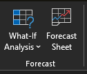
The Forecast Sheet functionality is accessed in the Forecast group of the Data tab.
Once you click Forecast Sheet, a dialog box appears. Forecast Sheet will create either a line or a bar graph to show both the past data and the future forecast. You enter the forecast end date below the graph preview.
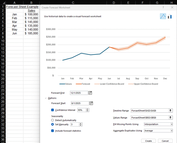
The Options caret has many important settings you may want to adjust. Below are a few important ones:
- Forecast Start: You can change the forecast start date to a date before the last date of the data. Excel only uses data before your start date to make its forecast. Comparing Excel’s forecast to your actual data for the last few months of the data in your dataset is one way to check how well Excel can forecast your data.
- Confidence Interval: The confidence interval setting is an extremely important setting. I explained it earlier in this lesson. Here is where you can adjust it.
- Seasonality: Seasonality refers to repeated patterns of fluctuations around a trendline. I used to work for a bank that made loans to farmers. The ag loan portfolio would be lowest in the winter, rise in the spring and summer, and then drop down in the fall after harvest. Some businesses have spikes in sales in the last month of each quarter. You can set the number of months for which your business has a seasonal pattern. Excel will use this time range to identify a repeating seasonal pattern and apply it to the trendline. This field would be set to 12 for an annual cycle of monthly data like that of the ag loan portfolio or to 3 for a quarterly sales seasonality.
- Include forecast statistics: Some people just can’t get enough statistics about their data. For those people, Excel gives the option to include forecast statistics. This creates a table of statistics similar to the FORECAST.ETS.STAT function.
Once you click the Create button, Excel’s Forecast-O-Matic works its magic. Excel creates a new worksheet with the forecast that we saw at the start of this lesson.
For more info, check out these topic pages: