Common-size financial statements are often prepared for a balance sheet or an income statement. A cash flow statement can also be prepared in a common-size format. The basic formula for common-size financial statement analysis is to take a line item, divide it by a base amount (e.g., total assets or total revenue), and then express the result as a percentage.
Here’s a little more about how each statement is usually prepared:
Balance Sheet
Divide each line item by the total assets. This will give you the percentage of each asset, liability, and equity item relative to the total assets. Here’s a simple example:
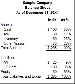
Every line item in this balance sheet is expressed as a percentage of the $285 in total assets. Those percentages are listed in the far-right column. By the way, I like to use examples with small numbers for simplicity. Feel free to add as many zeroes as you want in your head to make the numbers feel “real” to you.
Some important ratios in this simple common-size balance sheet include:
Cash-to-Assets
Formula: Cash / Assets
From the example balance sheet: $100 / $285 = 35%
A high ratio may indicate poor asset utilization. A low ratio is a warning of poor liquidity. This company has a high cash ratio but may have a major investment in the following year they are preparing for.
Debt-to-Assets
Formula: Debt / Assets
From the example balance sheet: $100 / $285 = 35%
A high debt-to-asset ratio may mean a company is overleveraged. This company’s debt-to-asset ratio isn’t too high, but a better test is the ratio of annual operational cash flow divided by annual debt service payments. That ratio is called the Debt Service Coverage Ratio (DSCR).
In this ratio discussion, I talked about ratios being “high” or “low.” Some can be determined internally, like the DSCR. If the DSCR is near or below one, the company can’t fund its debt payments from operational cash flow.
What’s considered high or low for other ratios may be better defined relative to the same ratios of competitor companies or the company’s industry. That’s the insight common-size financial statement analysis can provide.
Assets can also be stated as a percentage of revenues to assess asset efficiency. Most non-cash assets have the opportunity to be converted to cash. For example, companies with high A/R-to-Revenue or Inventory-to-Revenue ratios might be able to improve their cash levels. Those companies could focus on better collection of receivables, fewer credit sales, or improved inventory management (e.g., a more just-in-time production process).
Common-size analysis shows where opportunities lie. It shows what’s possible. Let’s say a company looks at its inventory levels and determines there is no way to reduce them. That may cause them to quit looking for efficiencies. They then compare themselves to a peer and find that their peer operates with a much lower level of inventory as a percentage of assets or revenue. It shows that better efficiency is possible. They think, “If the competitor can do it, why can’t we?” So, the search for efficiencies and improved performance begins again.
Income Statement
Divide each line item by revenue. More specifically, the base number is often net revenue, which is gross revenue minus returns and allowances. This will give you the percentage of each item relative to revenue. Here’s a simple example:
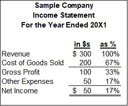
An important ratio in this common-size statement is the $100 gross profit divided by the base revenue of $300, which equals 33%. That ratio is better known as the “gross margin” or the “gross profit margin.” For many companies and industries, it’s one of the most important performance ratios. This shows how some line items on common-size statements are referenced more often than others, but each line divided by the base amount tells part of a story.
Another commonly cited ratio is net income as a percentage of revenue. In this example, the $50 of net income equals 17% of revenue. This ratio is known as the net profit margin. It’s the percentage of revenue that flows to owners’ equity. Of course, owners aren’t paid with income; they receive their distributions in cash. For this, we now turn to the cash flow statement.
Cash Flow Statement
The balance sheet base number is usually assets. The income statement base number is usually revenue. It may surprise you that revenue is usually the base number for the statement of cash flows.
Why isn’t it cash from sales? A case can be made that accountants are to blame for this. The most common cash flow statement format is the indirect method, which begins with net income. This basically links operational cash back to the income statement. Cash from sales is nowhere on an indirect cash flow statement, but revenue is easily identified on the income statement.
Many companies are often referred to by their revenue. For example, if a person states that they led a $100 million company, you usually assume that number refers to the revenue of the company. Peer groups within an industry are often grouped by their revenue amounts. The power of revenue as a base number carries from the income statement to the statement of cash flows.
Here’s a simple common-size statement of cash flows:
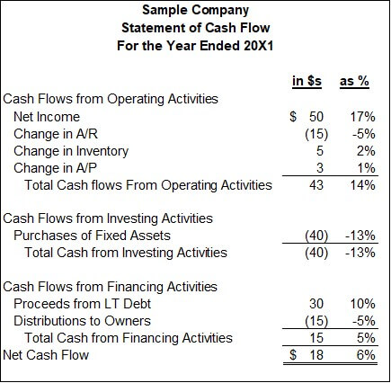
The top line of numbers in this statement is the bottom line net income from the income statement. The next few lines back us into operational cash flow, which is 14% of revenue. That’s a very important common-size number in this statement. It says that every dollar of revenue led to 14 cents of net operational cash flow available for financing and investing activities.
Companies almost always budget revenue. Revenue is often a key assumption in projections. The ratio of net operating cash to revenue allows people to quickly translate the key revenue assumption to the equally important cash flow amount available for (or needed from) creditors and owners.
A More Complex Example of Common-Size Financial Analysis
Some of you may have found my earlier examples a little simplistic. They are an approachable first pass of common-size financial statements. Simplicity enhances clarity.
Let’s take off the training wheels and look at a more complex “real world” example. I’m going to walk through an example common-size analysis that I used many times in my banking career. We used these reports to benchmark our bank against other banks. I still use these when deciding whether to invest in a bank’s stock or to assess their financial health before placing a deposit with them. This example is from banking, but the concepts apply to common-size analysis for most industries.
Banks prepare quarterly call reports, which include a balance sheet, income statement, and many other financial schedules. The regulators create Uniform Bank Performance Reports (UBPRs) from those, which anyone can get from the internet. You can say the name of this report by listing each letter in the acronym (i.e., U, B, P, R), but bankers also like to turn the acronym into a word that’s pronounced “U-Bipper.” Feel free to use either pronunciation in your head as we go through some examples. We’ll be going through a UBPR for Bank of America.
Below is a UBPR extract for two years of common-size balance sheets. The actual report used real dates, but I’ve expressed the years as 20X2 and 20×1 for example purposes. All other numbers are actual amounts from the Bank of America UBPR.
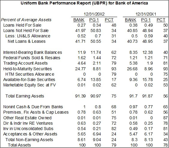
The first column lists the balance sheet line items. The next column shows each item as a percentage of average assets. This brings up an important consideration in common-size balance sheets. Do you want them as of a single point in time or as an average of a range of time? In this case, it’s expressed as the average over the past year.
The next column shows the common-size percentages of their peer group. The PG1 header for the column stands for Peer Group 1. The balance sheets of all the largest banks are totaled, and a common-size balance sheet is created from those totals. This is an example of competitor or industry analysis used for business environmental analysis.
The fourth column shows the bank’s common-size percentages as a percentile of the peer group’s percentages. They are in the 34th percentile for Net Loans and Leases. 66% of the peer group (100% – 34%) have more net loans and leases than them as a percentage of total assets. This could be a weakness if loans provide excellent risk-adjusted returns. It could be a strength if they have low exposure to loans when loans create big credit losses. The numbers must be interpreted in the context of company strategy and the business environment.
Columns 2-4 are repeated in the columns on the far right for the previous year. This allows trend analysis across multiple years. In the standard UBPR report, five time periods are compared. Thus, the UBPR allows both vertical and horizontal common-size analysis for Bank of America and its peer group.
Thinking Broadly About Base Numbers
Let’s look more broadly at base numbers by using other parts of the UBPR as examples. The first is a snip of their income statement expressed as a percentage of average assets.
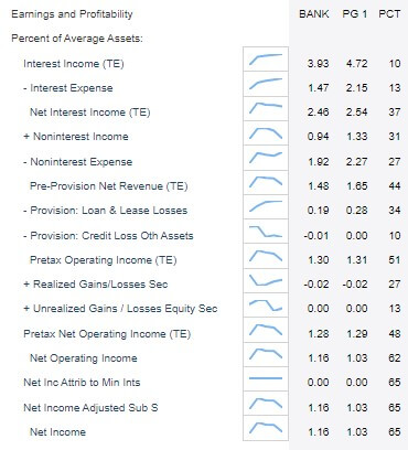
The first thing to note is that this is a common-size income statement that uses average assets, rather than revenue, as the base number. Return on assets (ROA) and return on equity (ROE) are two common earnings ratios used to assess a company’s performance. Bank earnings are driven by their balance sheet, so ROA is used more commonly in that industry. The report above shows how much each major line of the income statement adds to or subtracts from ROA. Companies in industries that prefer ROE could create a similar common-size income statement using equity as the base number.
You may have noticed the small trendline between the line titles and their amounts. This is a 5-quarter trendline of the bank’s common-size amounts. The report provides a graphical horizontal analysis and a numerical vertical analysis. It’s a very concise way of presenting so much information.
Now, I’ll horizontally graph the vertical analysis. Who said that accountants can see things from multiple dimensions?
One quick technical note about the graph: Interest income and Net Operating Income (NOI) are both expressed in tax-equivalent (TE) amounts, which reflects the tax benefit of tax-exempt securities. This detail isn’t material to our discussion, but I wanted to accurately label these items.
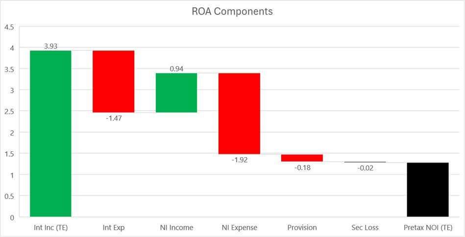
This waterfall graph shows how each income statement line item adds or subtracts to Pre-tax Net Operating Income (NOI) as a percentage of assets. Think of this as a visual decomposition of pre-tax ROA.
This graph starts with interest income as a percentage of assets, which is then reduced by interest expense. That’s followed by noninterest income, which includes the service fees and overdraft charges everyone hates. Next is noninterest expenses, which include salaries. That’s followed by the provision for loan losses and realized security losses to arrive at a pre-tax net operating income as a percentage of assets.
The graph for many companies would start with gross revenue followed by a reduction for the cost of goods. Next would be reductions for sales and administrative costs to arrive a pre-tax net oprating income. The Y-axis for such companies could be assets, equity, or revenue.
My guess is that you understand the relative importance of each line item much more quickly and effectively via this graph than the earlier vertical table of numbers. A graph of common-size amounts can be a powerful way to present common-size data.
Product Mix: Total Loans as a base Number
The table below uses total loans as the base number.
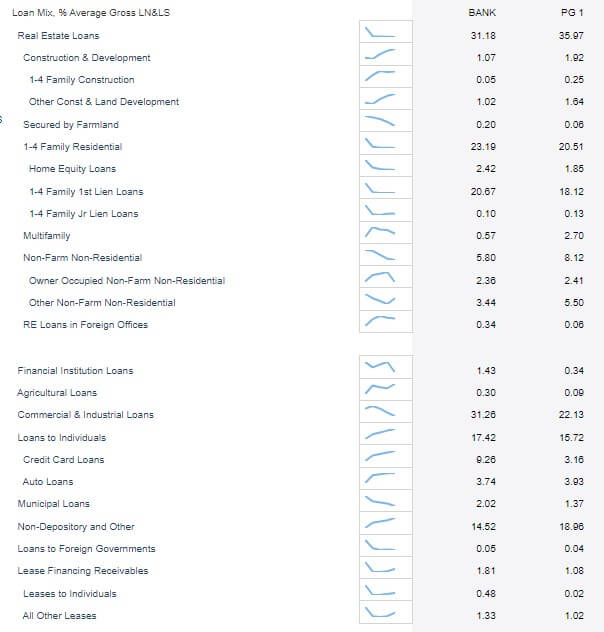
This is a form of product mix analysis. It’s actually a part of a decomposition of how most companies do product mix analysis. Most product mix analysis is based on revenue. Revenue can be broken down into sales units and the average price per unit. This table is the equivalent of doing a common-size product mix analysis on sales units. Market share data reports can show market share in units or by revenue.
A separate table in the UBPR calculates yields for each product. That would be the equivalent of average prices by product. These yields and other data can be used to create a product mix common-size statement based on revenue.
The UBPR does have a product mix analysis of non-interest-bearing product revenues as a percentage of average assets:
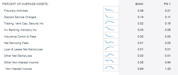
I mentioned that ROA is a very common performance metric in banking, so that’s why this table is expressed in assets. It’s a further drill-down into the components of ROA that I showed earlier.
Companies in other industries may show their product mix analyses using a base number of total revenue or equity.
The point of all this is that many base numbers can be used in common-size analysis. Some other popular options are:
- Number of Shares: This is often done when calculating balance sheet or income amounts in per share amounts. Those per-share amounts are often used as valuation metrics. The most well-known is earnings per share. Revenue per share is also commonly monitored.
- Users or Subscribers: A list of products or revenue sources may use one of these base numbers. Future revenue is then projected by multiplying revenue per user by projected users. Per-user metrics are often popular for products that are not yet earning revenue (i.e., offered for free), but a portion of the user base is expected to pay in the future.
- Visits or people served: These were commonly used base numbers when I was the CFO of a medical clinic. Ironically, it’s also a base number used when assessing the performance of amusement parks.
For more info, check out these topics pages: